Click2SciencePD Website Redesign
Since the grant project's official launch in 2015, Click2Science frequently received feedback from users that the site was difficult to navigate. Generally, users had trouble locating resources and didn't understand how to use the resources appropriately. In 2017, Click2Science was undergoing major project revisions, including rewriting of all the staff development guide resources, editing of many video-based learning modules, and rehauling of the foundational "20 Skills that Make STEM Click" into a framework of 3 strategies and 16 skills. These significant adjustments to the project and its resources, in addition to frequent feedback about the quality of the site's user experience and interface, resulted in the need for a complete website redesign and relaunch.
In order to address user's concerns, the redesign process required a user-centric approach. The redesign process was focused on the voice of customers and incorporated one-on-one user interview and focus group sessions. Secondary user experience and user interface design research was also used to inform design decisions throughout the process.
Download the Click2SciencePD.org User-Centric Redesign case study for more details.
Roles:
-
Web Manager
-
UX/UI Designer
-
Visual Designer
Team Members:
-
Melissa Fenton, Project Coordinator
-
Kerri Wingert, STEM Content Author
-
LiveStoryBoard, Inc., Web Developer
Tools:
-
Drupal Content Management System
-
Adobe Photoshop
-
Adobe Illustrator

BEFORE

One Click2Science case study report published in December 2016 which documented the analysis and findings from interviews with 10 professionals said the following:
The most common topic across all interviews was participants' perception of the website. "The website is very deep and very rich... but hard to navigate." Several participants echoed these claims by noting they often "get lost in the navigation [of the website]" and often referred to the general interface as "difficult." One participant explained that they "need some way to access certain areas quicker." Other participants reflected that struggles with the web interface may be one of the reasons "we haven't used Click[2Science] as much as we intended."


PROCESS
Initial steps in the redesign process included conducting seven one-on-one listening sessions, conducting industry research, and conducting analyses of other websites. This research was then used to reconstruct the site's navigation and information architecture. Once a handful of potential navigations were developed, sketches, wireframes, and mockups were developed.

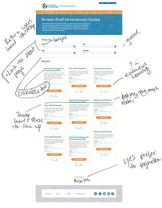
Top-level parent pages were fully mocked up using Adobe Illustrator. Templates for major content types were also drafted using Illustrator. The static mockups went through various iterations and evolved throughout the process. The mockups were used to help facilitate three focus group session. Additional research was conducted to address visual accessibility issues. Once the Illustrator mockups were officially approved by Click2Science leadership, they were shared with LiveStoryBoard, Inc. at which point web development and content updates began.
AFTER


Working with the external web development agency, the mockups were turned into a fully functioning website with updated content. The site is built using the Drupal Content Management System.
Following the relaunch, improvements in behavior metrics for new visitors included a 17% decrease in bounce rate, 64% increase in length of visit, and a 34% increase in depth of visit. Additionally, the overall registration conversion rate increased by 7.3% following the relaunch. The site also saw a 134% increase in the percent of valuable exits or the percent of all visitors who clicked a link to visit Better Kid Care where web lessons are house and sold. This correlates with a 22% increase in web lesson sales.